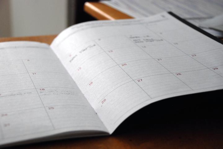
This is something I have wondered about for a while and I would love responses from you all! When you think of the months of the year (whether to try to remember when something happened, calculate how much time before a certain event, think about a date on the calendar, etc.), what do you see? Are the months going across in a straight line? In a straight row going down? Are they in columns? Perhaps a circular shape to reflect the cycle of the year? Before reading further, reflect and have your image in your mind.
When I think of the months of the year, I always visualize them the same way. I see the names of the months in three columns like this.
| April | May | September |
| March | June | October |
| February | July | November |
| January | August | December |
I also have a distinct memory of the calendar charts in my 2nd grade classroom, over on the right wall. That chart looked like this.
| January | May | September |
| February | June | October |
| March | July | November |
| April | August | December |
However, I also remember a small circular chart the four seasons on a wheel with an arrow in the middle. I believe the arrow would move from winter on the bottom left up to spring on the top left. I am pretty sure that’s why I switched around the first column in my head so that January-April go up visually instead of down. Or I might have switched that in my head so it seemed a smaller step from December to January of the new year when I was mentally tracking months.
So now that you’ve stopped to think about how you visualize the months, does it reflect how you initially learned those concepts through a chart or diagram in school? Are there other abstract concepts (whether elements of the calendar, times tables, time, etc.) that were shaped by how you were taught? Or perhaps partially reflect how you were taught with some of your own adaptions? I imagine people from different cultures or language backgrounds might especially notice differences. Perhaps there would also be generational differences. For example, if older generations are told a time, I wonder if they tend to visualize a round clock, while younger generations might see the time in digital format in their mind’s eye. Though it’s likely both generations are easily able to read either format when they see it, they probably have a default in their mind.
So please comment and share your thoughts. I’m so curious to hear from others!

I picture a circle, with January at 12:00, and then months of the year progressing clockwise around the circle.
LikeLike
I picture them in one column from January to December or if I’m “scanning” through the months, like visualizing them to decide what it upcoming, I will see them as calendar pages and then go from left to right as whole months rather than just the names of the months.
LikeLike
I suspect you are the only person that visualizes a calender; starting from the bottom of the chart on one row, and then from the top of the chart on the next. It took me several takes to understand what the first chart for. My brain works reading from left to right. So, both of your examples were not in the format style that I visualize.
LikeLike
I don’t recall learning the months by any visual aid, just as a recitation. If I had to put them into a form, it would just be a list, starting with January at the top. I “feel” December January & February as winter, March, April & May are spring, June July & August winter, and September October November as fall. I would never divide the months into only 3 columns.
LikeLike